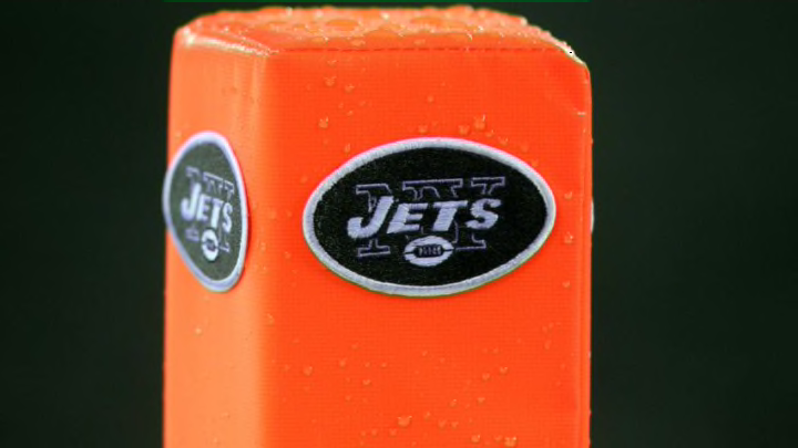
Over 1,400 football fans recently voted for their favorite NFL logo over at FanJuicer.com. They also had a graphic designer give an analysis and sadly, the New York Jets logo was considered “too busy.”
Football fans have always been fanatics when it comes to their favorite football team. They buy jerseys, hats, apparel, pretty much anything with their team’s logo on it. Recently, a poll over at FanJuicer.com asked over 1,400 football fans what the best looking NFL logo was. They even had a graphic designer chime in their thoughts on every logo and well, the New York Jets didn’t get a good review.
FanJuicer.com broke down where every logo ranked with the New Orleans Saints and Detroit Lions being on top, receiving the most votes with 154 each for a tie. The worst team logo as voted by the fans in this poll went to the Cleveland Browns which earned just 14 votes.
In that article written by FanJuicer.com, they broke down where the Jets logo ranked as it was the second-worst in this poll. The Jets logo only received 27 votes by fans as Eugenie Mclellan, a freelance graphic designer based in New Orleans, gave her thoughts on the logo.
More from The Jet Press
- NY Jets: Analyzing the ways to upgrade the cornerback position
- NY Jets are ‘the only viable’ landing spot for Deshaun Watson
- NY Jets: 5 linebackers to target in 2021 free agency
- NY Jets: 3 tight ends to target in 2021 free agency
- NY Jets: 3 more players who should be cut in the coming days
Here is what she had to say about the Jets logo and why it likely didn’t receive as many votes as fans would have liked to have seen:
The Graphic Designer: There’s too much text layered on top. It’s hard to read and clunky. It doesn’t make visual sense and isn’t clear what is going on.
FanJuicer: So you are saying it is too busy?
The Graphic Designer: Yes, I am saying that, but it it is busy in a way that does not add anything.
FanJuicer: What are your thoughts on this oval shape?
The Graphic Designer: The oval is necessary because otherwise all the other elements do not mix properly. Without the oval there is nothing to contain everything going on.
Clearly, if you’re a fan of the Jets, the logo is just fine but it’s no secret that fans for a while now have been asking for new uniforms. A new logo, on the other hand? Not so much since it has a lot of nostalgia during the glory years of the Jets where they were a competitive team and were winning a lot of football games on a steady basis.
In the grand scheme of things, Jets fans have suffered for decades now without having a definitive answer at quarterback. They’ve only made one Super Bowl appearance which featured Joe Namath guaranteeing victory and they left the game victorious. Since then? A lot of what if situations, losing seasons, and a plethora of draft busts.
Must Read: Top 10 Jets draft busts of all-time
Either way, that logo is symbolic and means a lot to many Jets fans across the globe. While Mclellan has her opinion in regards to the graphic design of the Jets logo, it’s likely not going to be changed anytime soon. What do you think about her assessment of the Jets logo? Leave your comments below if you agree with her or disagree!
